
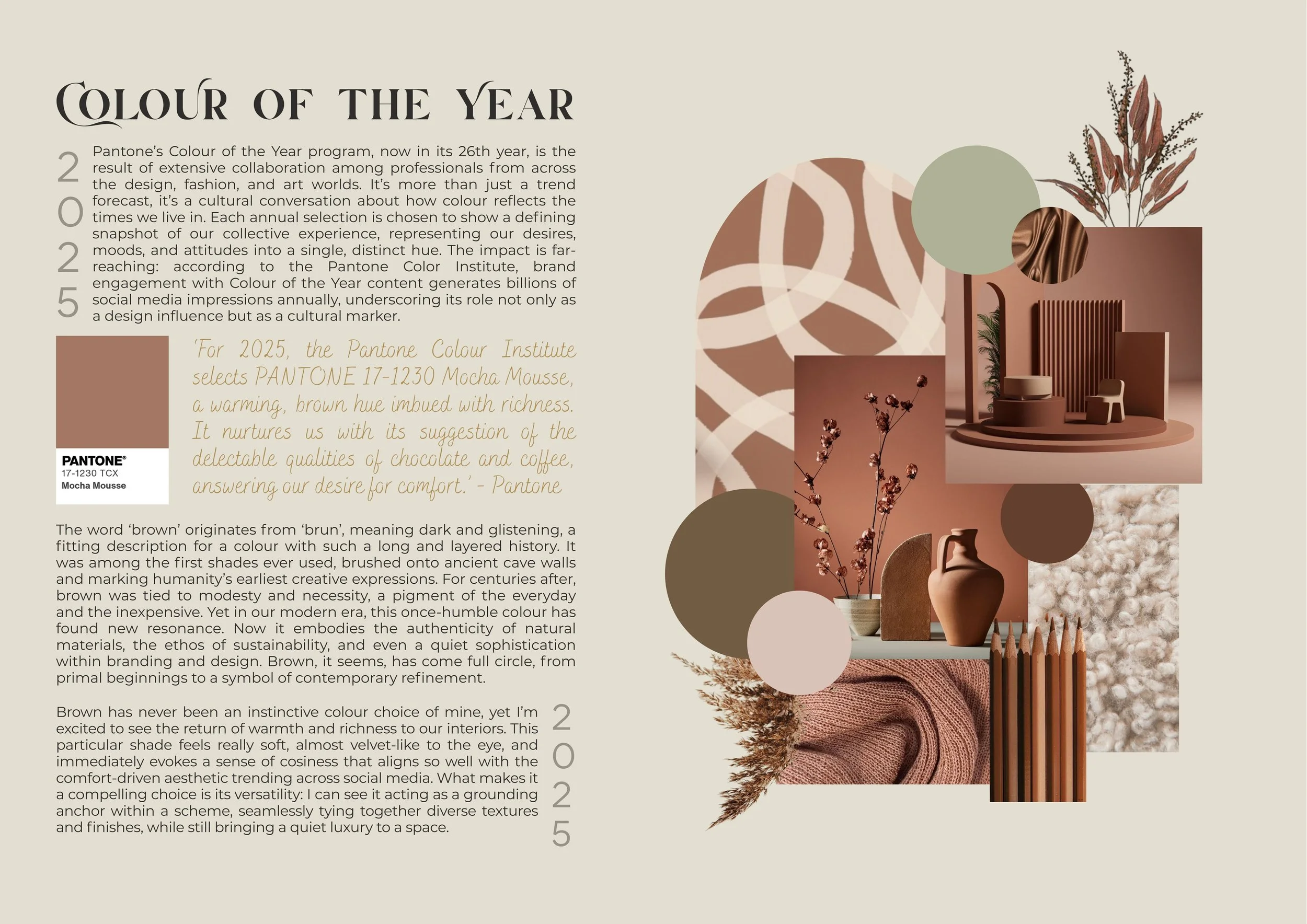
Colour of the Year 2025 Analysis
I’m fascinated by the power of colour to shape emotion, atmosphere, and meaning. In this project, I take a closer look at Pantone’s Colour of the Year 2025, Mocha Mousse, exploring not only its cultural and historical significance but also the emotional responses it can evoke when applied in different contexts. My process begins with research and reflection, unpacking the theory and storytelling behind the hue, before translating those ideas into a mood board of textures and imagery. From there, I develop concept boards that reimagine the colour across varied environments, showcasing its versatility and potential within design.
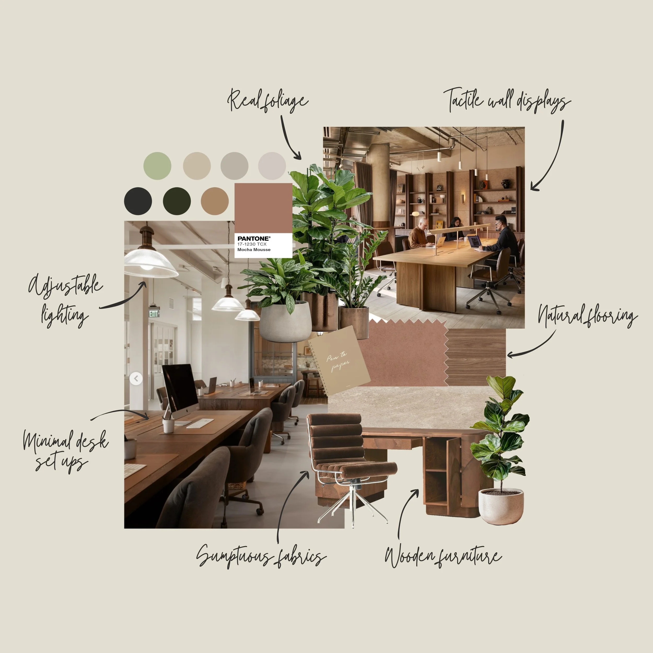
Work, Warmth & Wellbeing
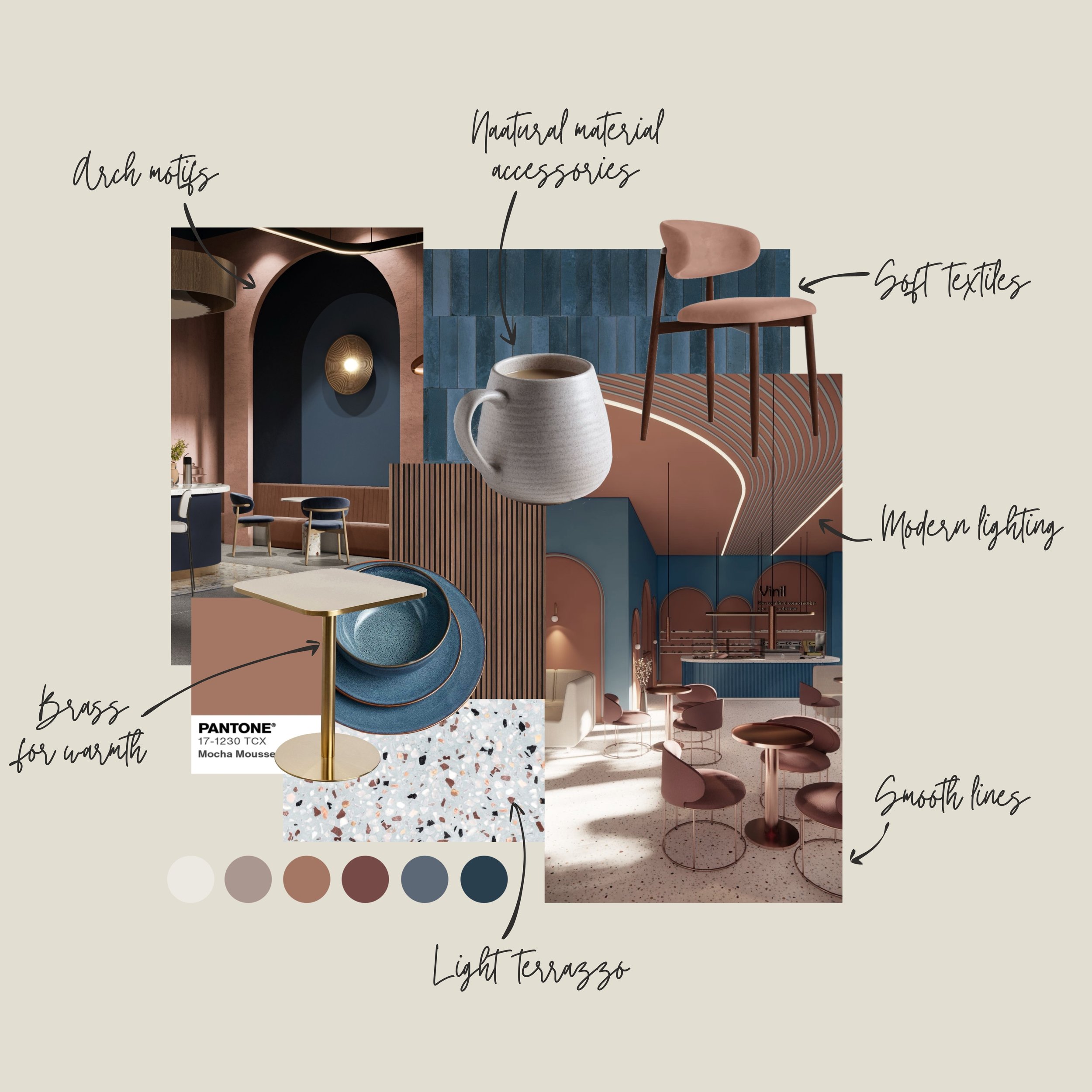
This concept takes inspiration from the comforting associations of Mocha Mousse to create a café that feels both sophisticated and inviting. The atmosphere is designed to conjure images of a cosy autumn afternoon, sipping a warm drink, enjoying an artisanal pastry, and connecting with friends.
Architectural arch motifs and smooth, flowing lines are carried through the furniture and detailing. These touches bring a modern sensibility while retaining a timeless elegance, helping to define zones within the space without harsh separations.
Colour plays a central role in the design. While deep blue sits opposite brown on the colour wheel, here it works in harmony with Mocha Mousse, providing richness and depth. The pairing comes together in the light terrazzo flooring, which balances the scheme and adds a sense of brightness and lift to the palette.
The design is elevated further with carefully considered materiality. Natural material accessories, ceramics, wood, and stone, introduce a sustainable and tactile element, reinforcing the artisanal narrative of the café. Soft textiles and brass accents add layers of warmth and refinement, while modern lighting completes the space with a welcoming glow.
Altogether, this concept blends richness with restraint, crafting a café environment that feels grounded, stylish, and effortlessly inviting.
A Taste of Comfort
Drawing inspiration from Pantone’s Colour of the Year, Mocha Mousse, I began by exploring how this particular tone of brown can influence mood within a workspace. As a soft neutral, it naturally elicits a sense of calm, grounding us through its deep association with the earth. This connection ties directly into principles of biophilic design, bringing elements of nature indoors to support wellbeing and foster a sense of balance.
With this in mind, I envisioned an office that feels calm yet creative: a space where expansive ideas can emerge in a soft environment, free from the overstimulation that often comes with harsh lighting and stark, bright colours that are traditionally found in modern offices. To strengthen the biophilic element, I incorporated natural materials such as stone-effect flooring and wooden desks, both of which act as grounding anchors within the scheme. Living foliage not only purifies the air but also adds a soft, organic contrast that keeps the space visually engaging.
Practicality and user experience were also central to the design. Adjustable lighting ensures the environment can shift with the needs of the day, while minimal desk clutter supports a customisable setup that empowers focus and creativity.
Altogether, this concept board reflects an office that is both nurturing and functional, a space designed to ground its users in calm while opening the door to fresh, expansive thinking.
Written and mood boards created by Bri Riley-Moore
September 2025