Taylor Swift Inspired Interiors
The songs were already soundtracks to my work, usually playing in the background as I worked on other projects, so it only felt natural to dive into a personal project centred around something I already find inspiring.
Taylor Swift’s albums are already so visually rich, each era crafting its own world through lyrics, imagery, and storytelling. But I’d never seen that world translated into interiors.
So when The Life of a Showgirl was released, it felt natural to take that energy into design form, reimagining each album as a commercial space: a bar, a café, a florist, a tea room. Spaces that hold emotion, atmosphere, and narrative, just like the songs themselves.
This is Taylor Swift Interiors, six concepts that turn music into mood, and lyrics into light.
The Opalite Lounge
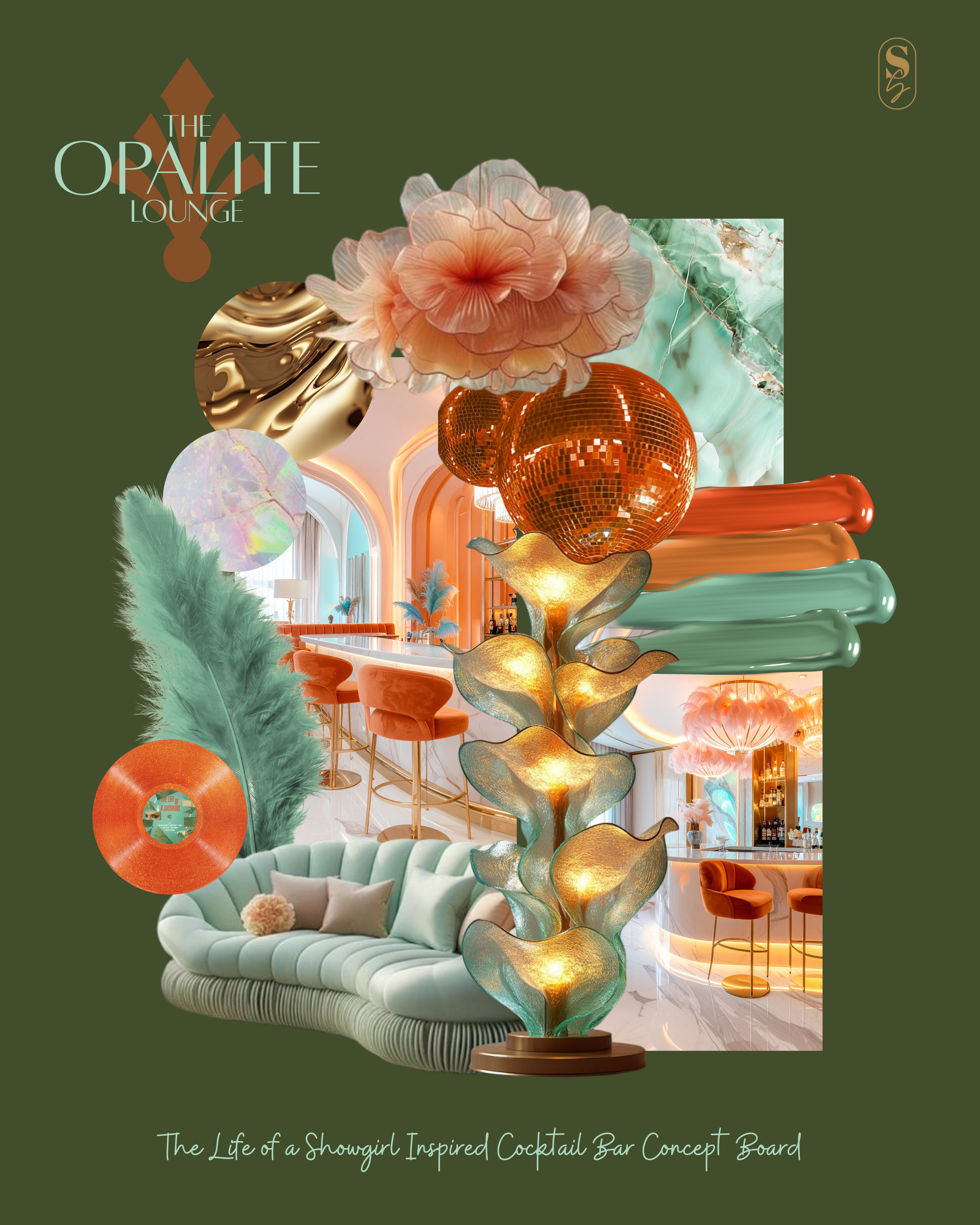
The Opalite Lounge reimagines The Life of a Showgirl as a cocktail bar, a space where confidence, vulnerability, and transformation coexist.
This concept explores the dual nature of performance: the shimmer of the spotlight against the quiet moments backstage. Iridescent surfaces echo stage lights; mirrored glass and satin textures suggest elegance with an undercurrent of fragility. Soft blush tones meet lush teals and vibrant orange hues, creating contrast, the same tension that defines the album itself.
The palette draws from opalite’s subtle luminescence, translucent, dreamlike, layered with light. It’s a celebration of artifice and authenticity, where every surface tells a story of becoming.
The Opalite Lounge invites guests to pause between acts, to sip, to reflect, and to remember that even the brightest showgirl holds her own quiet glow.
Willow & Ink
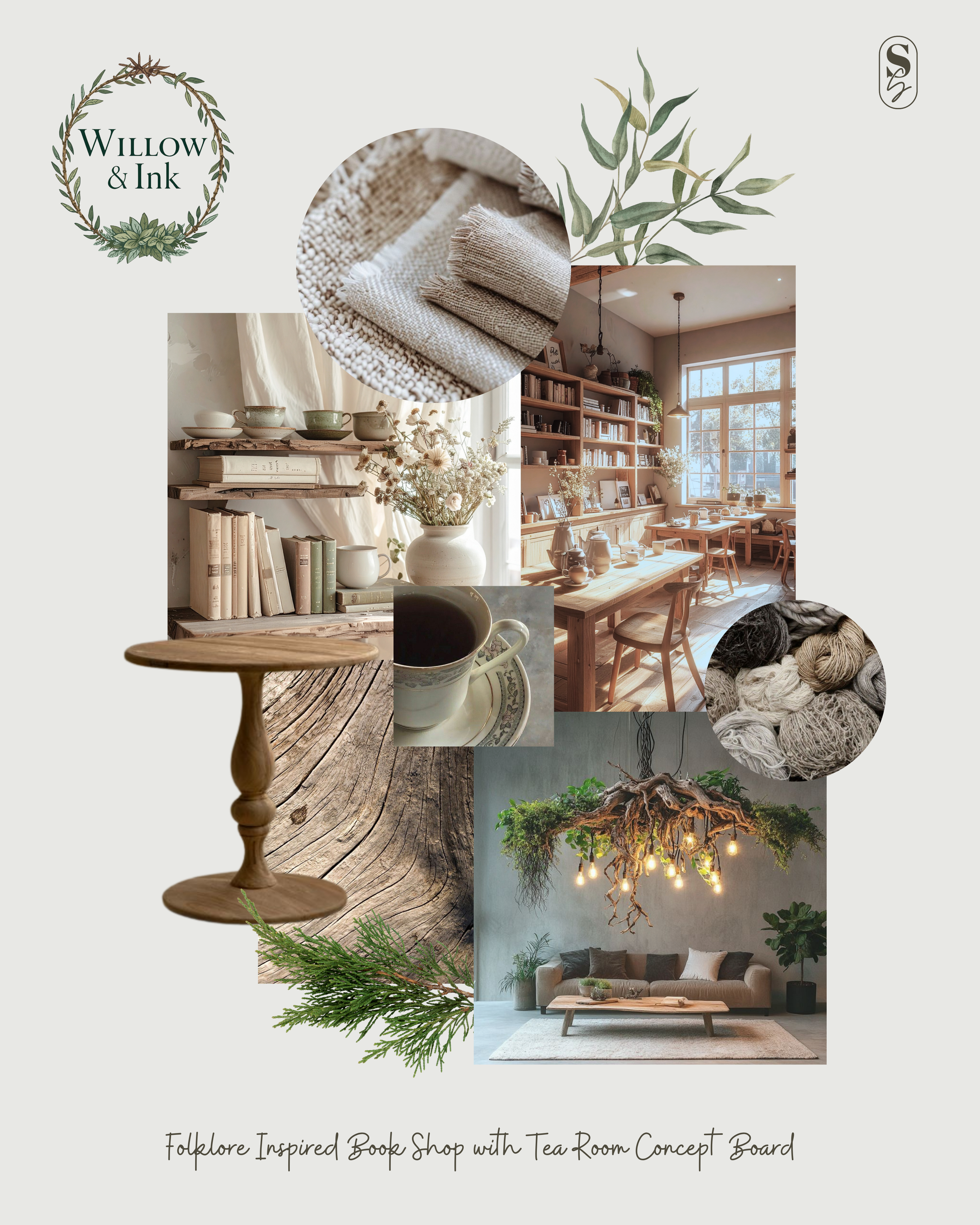
Willow & Ink is a tea room and bookshop concept inspired by Folklore, an album that’s long been one of my personal favourites. There’s something timeless in its quiet storytelling, the way it turns small moments into myth. Translating that into a space felt natural, like tracing the lyrics into texture and form.
The concept began with a Pinterest study of woods, linens, and hand-thrown ceramics. From there, I built a palette of sage greens, weathered oak, parchment, and soft day light, hues that feel like late afternoon in a story you never quite finish reading.
This space is about warmth and depth, mismatched tables, walls lined with books, the scent of tea leaves, and candle wax. A retreat for writers, wanderers, and quiet thinkers.
Willow & Ink is a place to listen, read, and rest, where words, like design, become a form of gentle storytelling.
The Crooked Love Café
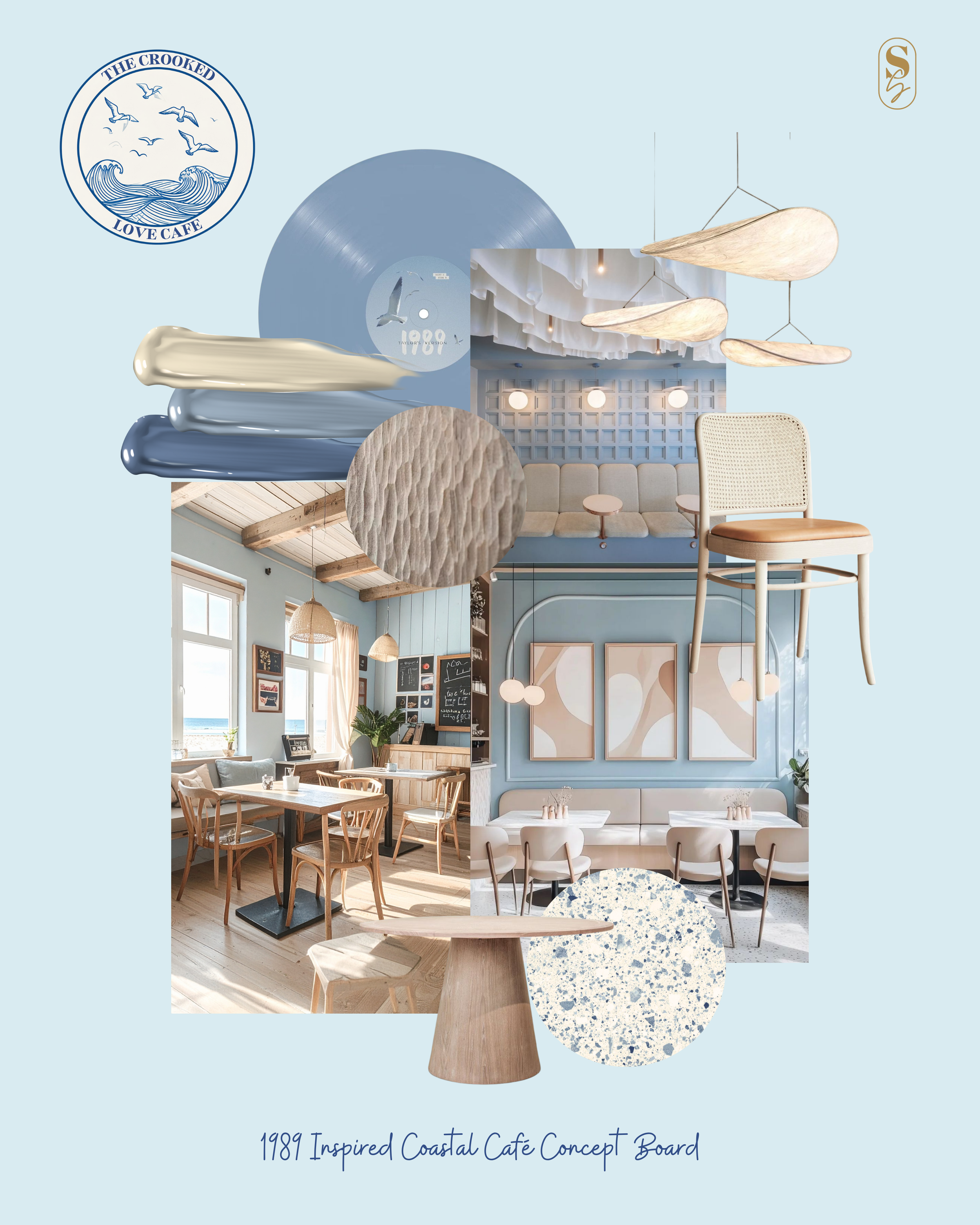
The Crooked Love Café reimagines 1989 (Taylor’s Version) as a coastal retreat, bright yet grounded, nostalgic yet new. When the album was re-released, it reignited my love for its clean, confident energy. Translating that into a physical space felt like designing to the pulse of pop itself.
Coastal design isn’t something I typically gravitate toward, it can so easily slip into cliché. So I treated this concept as a challenge: to create a seaside café that avoids the obvious motifs and instead focuses on texture, tone, and atmosphere.
Think driftwood, pale stone, woven linen, and soft navy, a palette that feels sun-warmed but lived-in. The materials tell their own story: imperfect, honest, touched by time.
The Crooked Love Café is less about the beach itself and more about memory, the feeling of windblown laughter, Polaroid snapshots, and the bittersweet glow of somewhere you used to go.
Cornelia Blooms
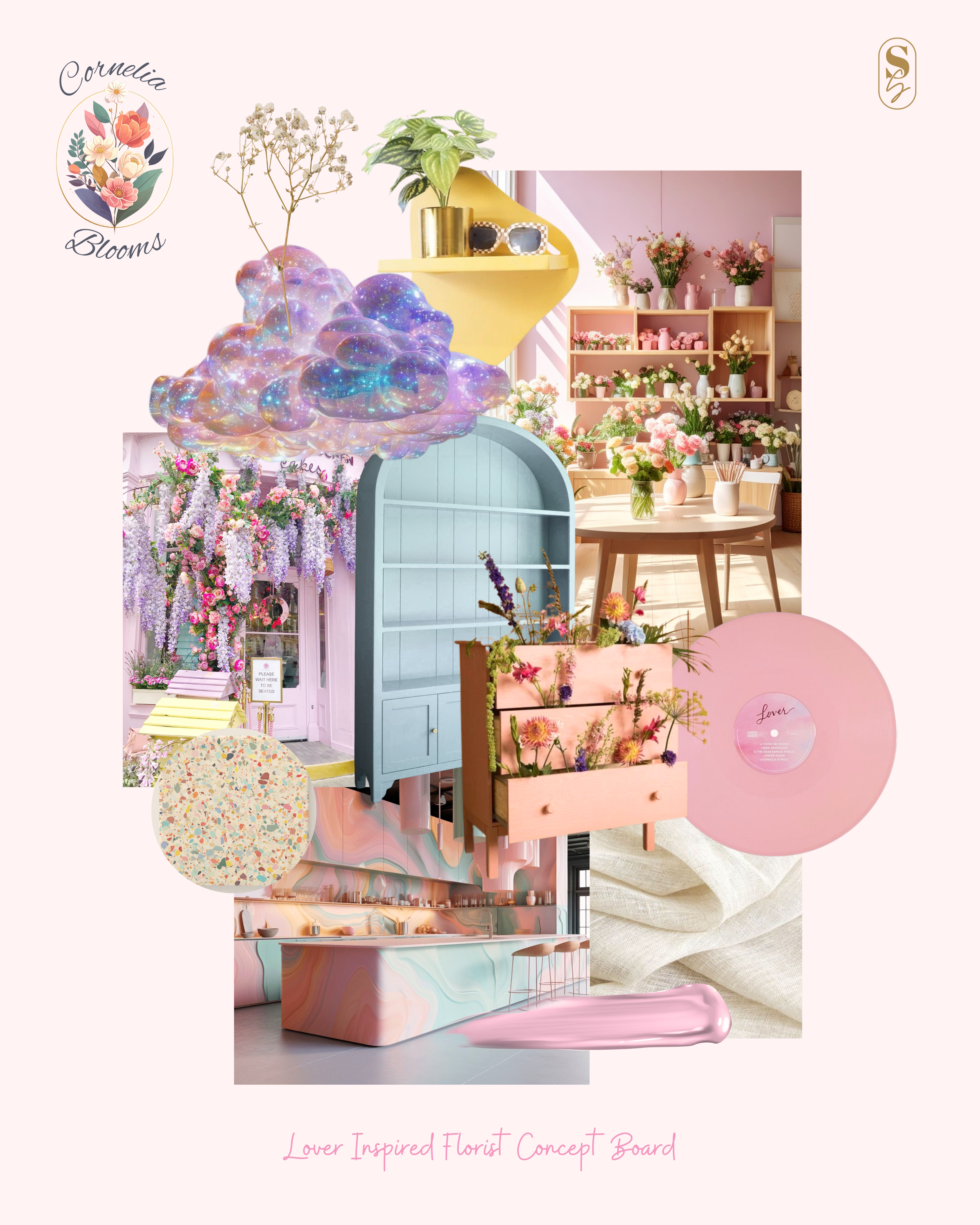
Cornelia St. Blooms began as a concept inspired by Lover, an album I’ve never felt deeply drawn to musically, yet one that offered such a beautifully light, playful visual world to design from. Translating that pastel-toned optimism into a space became a chance to let go of restraint and simply create with joy.
As a florist–café hybrid, Cornelia St. Blooms celebrates tactility and togetherness, petals scattered on tabletops, sunlight filtering through glass, conversations floating between bouquets. The palette leans into the album’s dreamy tones: petal pink, soft lilac, cream, and washed teal, grounded by natural timber and hand-sculpted ceramics.
Floristry has always fascinated me, the way beauty and impermanence coexist. Designing this space allowed me to play with that rhythm: arranging, layering, letting go. I also really enjoyed thinking up quirky and different display installations within the space. I could really see this being an Instagram-famous high street boutique, known for its whimsical display of blooms.
Cornelia St. Blooms feels like a gentle exhale, a reminder that not every project has to be serious to be soulful. Sometimes, lightness is its own kind of depth.
22 Bottles
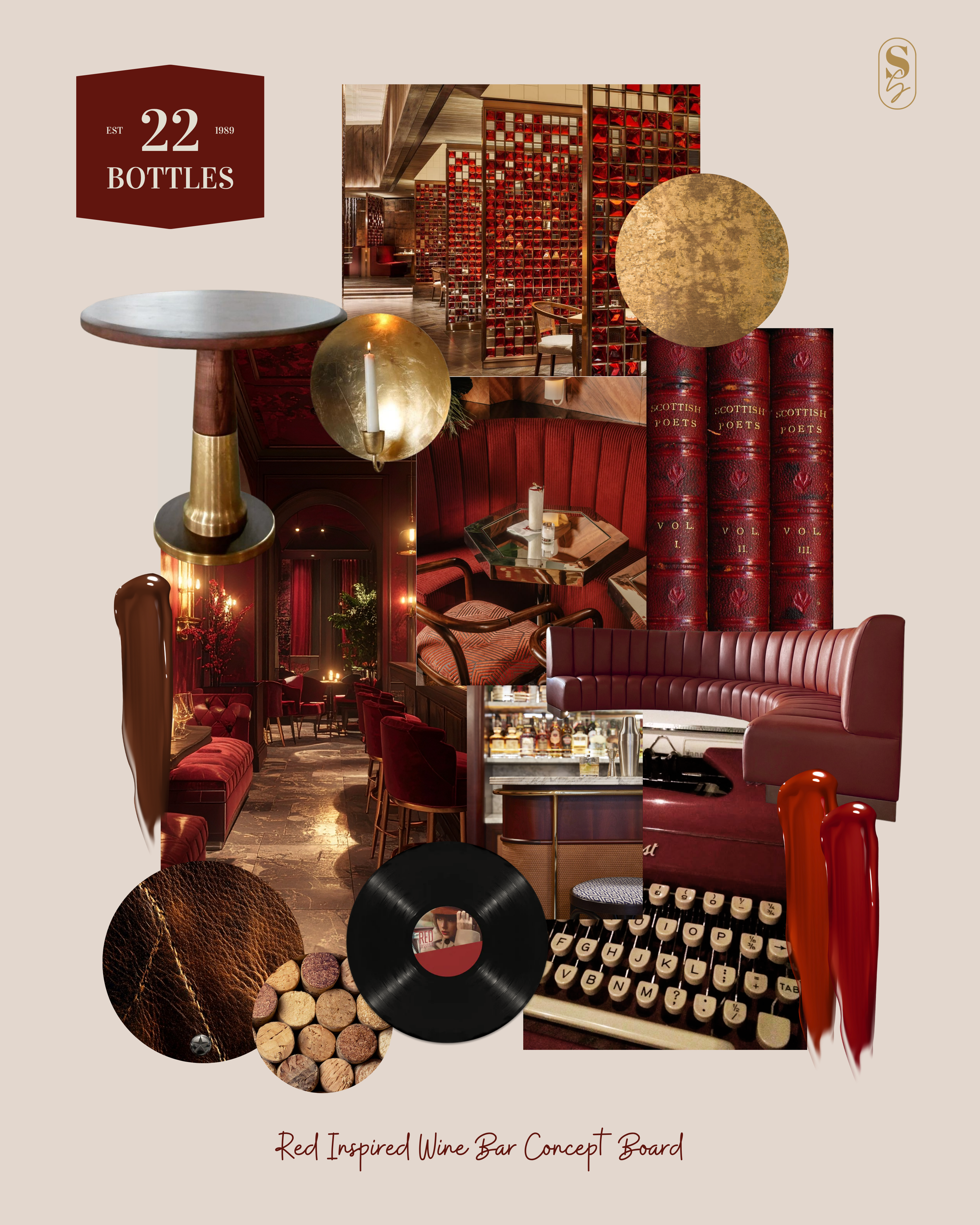
22 Bottles reimagines Red (Taylor’s Version) as a contemporary wine bar, rich, layered, and a little bittersweet. I’ll admit, Red was never an album I connected with deeply until its rerelease, but approaching it through a design lens gave me a new way in.
I found myself drawn to the album’s contrasts: the tension between youth and reflection, chaos and calm, love and loss. Translating that into a physical space meant exploring deep burgundy, burnished brass, amber light, and velvety textures, a palette that feels emotional and immersive without slipping into nostalgia.
The design balances polished sophistication with raw edges: patinaed metals, curved seating, tactile fabrics that invite touch. It’s a space that lingers, much like the stories told over a shared bottle.
22 Bottles became a reminder that not every concept needs to start from personal attachment. Sometimes, connection grows through the making, in the layering of tone, texture, and quiet mood.
The Vault
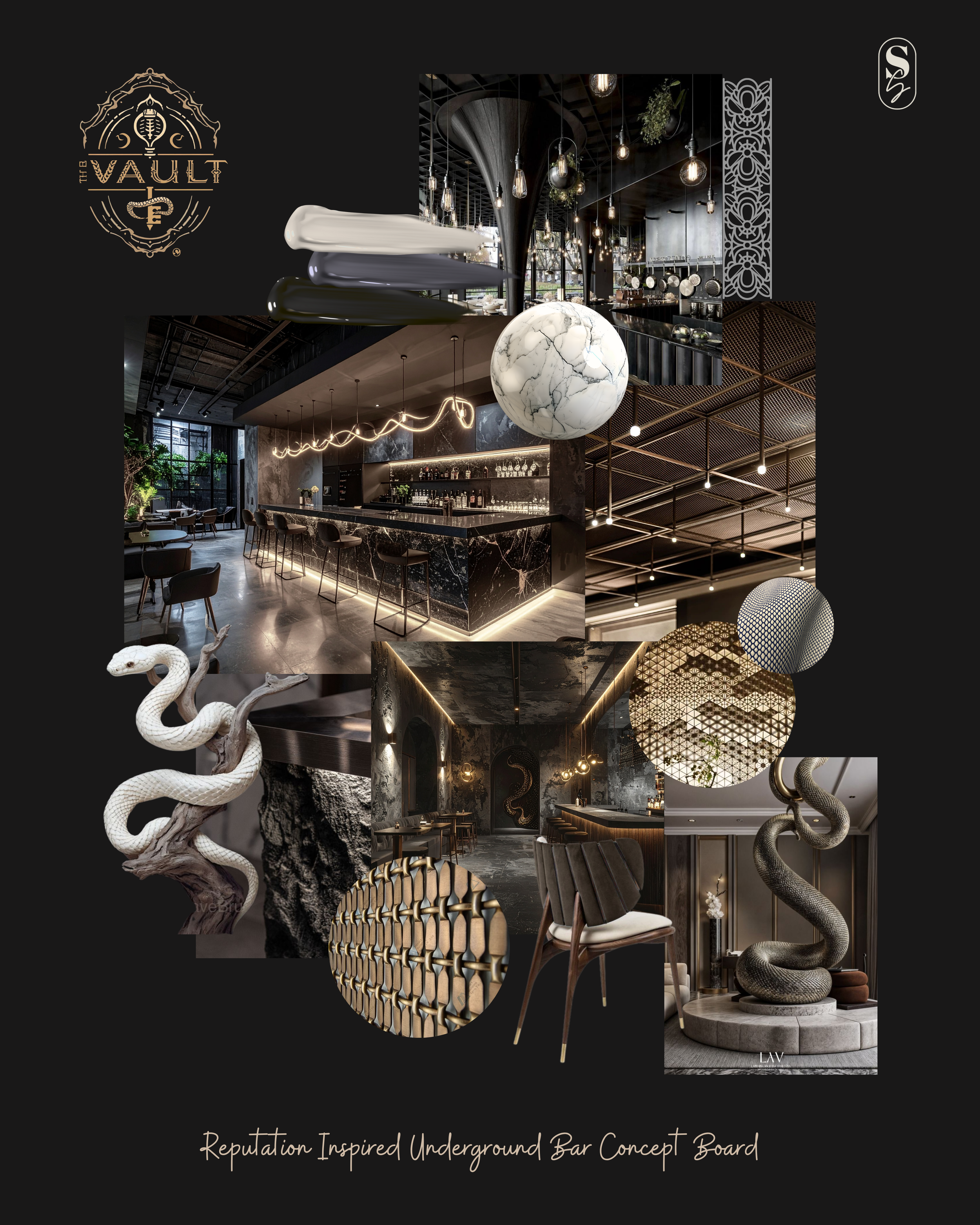
The Vault reimagines Reputation as an underground bar and restaurant: bold, tactile, and unapologetically self-assured. I’ve been so excited for the Reputation (Taylor’s Version) release, curious to see how those songs, and that persona, will evolve with time. Translating that energy into a space felt like stepping into the album’s heartbeat: pulsing, deliberate, defiant.
Unlike many of the other concepts, The Vault embraces tension, sharp lines, dark palettes, and cold, weighty materials like stone and steel. Lighting cuts through shadow; reflections move like whispers. It’s a space of dualities: secrecy and spectacle, edge and elegance.
Subtle motifs nod to the album’s iconography, a snake motif coiled in brass, scales echoed in tile, metallic lettering that glints like a secret revealed.
Designing The Vault was both a contrast and a release, a chance to explore control, confidence, and transformation through materiality. It stands as a reminder that strength, when thoughtfully designed, can still feel deeply human.
